From tech startups to wedding invitations, the right geometric sans serif font adapts to any context. I’ve assembled 23 unique styles, ranging from futuristic to soft-rounded, to provide you with the ultimate toolkit for any creative task.
This post contains affiliate links. If you purchase through them, I may earn a small commission at no additional cost to you. I only recommend premium digital assets and files I genuinely trust for professional use.
Structured Geometric Typography for Distinct Brand Identities
Geometric sans-serif typography builds structural clarity through basic circles, squares, and precise angles. This lineup features 23 exceptional typefaces built on strict mathematical proportions, clean optical balance, and minimal stroke contrast. Graphic designers, UI engineers, and brand strategists gain a solid foundation of functional letterforms suitable for sleek digital platforms, tech branding, and minimalist editorial design.
1. Montreal: The Essential Geometric Sans Serif Font for Modern Branding
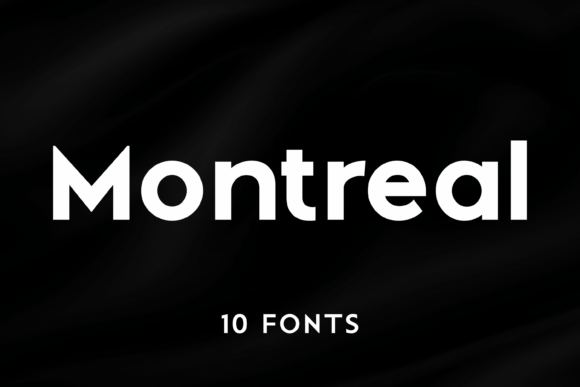
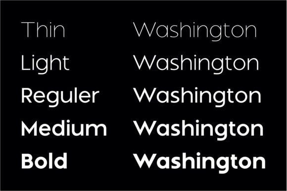
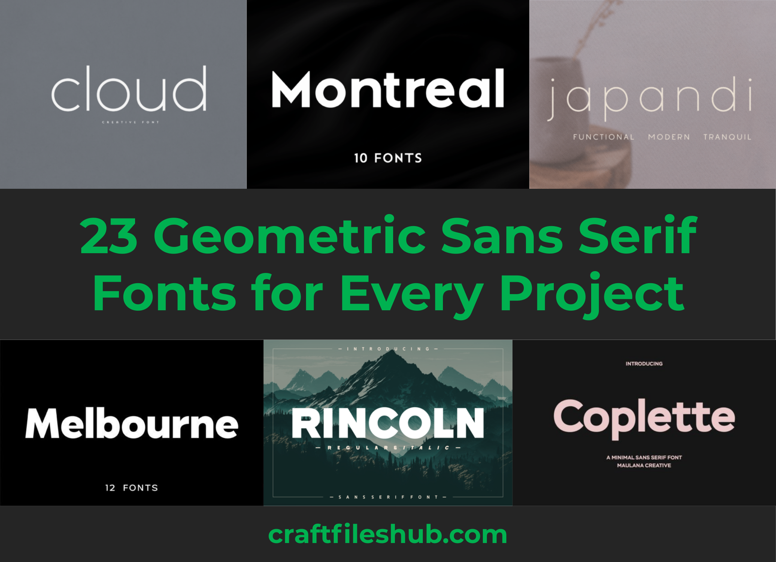
I’ve spent quite a bit of time working with different typefaces, and Montreal stands out as a remarkably balanced geometric sans serif font. Its 10 distinct styles move seamlessly from an ethereal Thin to a commanding Bold, all while maintaining those signature razor-sharp angles and even proportions. I love how the clean lines provide a sophisticated, minimalist foundation that doesn’t feel cold or clinical, but rather intentionally modern.
This family is a powerhouse for sleek corporate identities, futuristic tech branding, and minimalist editorial layouts. The primary advantage here is the flawless legibility paired with a harmonious geometric rhythm. Whether I’m designing a high-impact logo or a clean website interface, Montreal’s versatility ensures the message remains clear and visually striking across any medium.
2. Agoma: A Versatile Geometric Sans Serif Font for Professional Branding
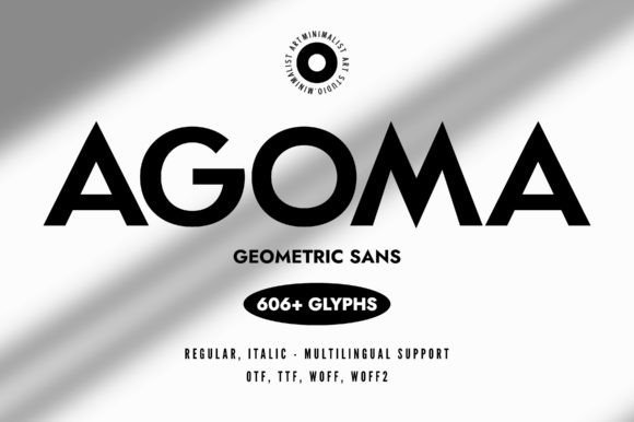
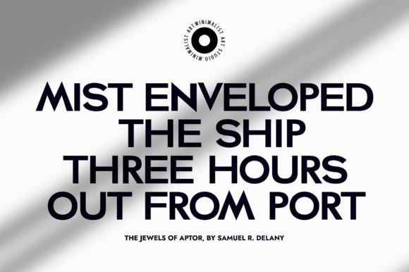
When I look at Agoma, I see a geometric sans serif font that doesn’t just sit on the page—it commands it. Its architecture is built on crisp lines and sharp angles, offering over 600 glyphs that provide incredible flexibility for any creative project. I particularly enjoy the way the Regular and Italic weights maintain such a clean, professional “grotesk” vibe while remaining remarkably easy to read at any scale.
This typeface is a natural fit for modern branding, high-impact web design, and bold packaging. The main advantage is its uncompromising legibility combined with a minimalist aesthetic that feels both polished and powerful. Whether I’m drafting headlines for a digital campaign or designing sleek print media, Agoma provides that striking, sophisticated look that helps a brand truly stand out from the crowd.
3. Coplette: A Versatile Geometric Sans Serif Font for Web and Print
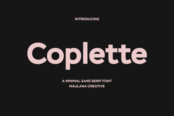
I view Coplette as a masterclass in restraint, a semi-geometric sans serif font that balances mathematical precision with a soft, approachable feel. It strips away the unnecessary, leaving a clean silhouette that works beautifully for logo designs, social media content, and cinematic movie titles. I love how its minimal structure allows it to function as a primary hero font or a reliable secondary typeface when paired with a more decorative serif.
This font is a dream for organized workflows because it is PUA encoded, giving me effortless access to every glyph and swash without needing specialized software. Its primary advantage is sheer versatility; it maintains high legibility in long-form text and book layouts while still feeling punchy enough for advertising and branding. Whether I’m building a website or a print portfolio, Coplette provides that “just right” modern aesthetic.
4. Melbourne: A Timeless Geometric Sans Serif Font for High-End Branding
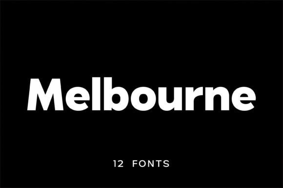
I see Melbourne as a bridge between 20th-century neo-grotesque traditions and today’s digital sharpness. This geometric sans serif font family features a high x-height and minimal stroke contrast, giving it a bold, unmistakable presence on the page. I love how its 12 unique styles allow for a smooth transition from subtle body text to high-impact headlines, all while maintaining a polished, consistent rhythm that feels incredibly sophisticated.
This typeface is my top recommendation for fashion branding, UI/UX design, and sleek editorial layouts. The primary advantage is its versatility; it brings a “Global Influence” to logos, signage, and packaging where clarity is non-negotiable. Whether I’m working on a modern magazine spread or a tech startup’s website, Melbourne’s precise geometry ensures the final product looks professional, confident, and timeless.
5. Pogonia Font: A New Standard for Modern Aesthetics
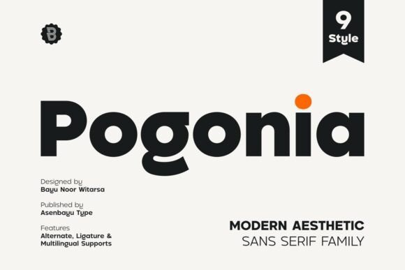
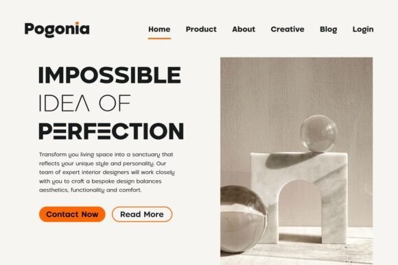
I’ve discovered that Pogonia is a rare gem that perfectly blends a geometric sans serif font structure with subtle humanist touches. This unique mix conveys a sense of simplicity and versatility that remains timeless across any project. With 9 distinct styles and a wealth of alternates and ligatures, it offers a level of creative freedom that makes every layout feel custom-made and high-end.
This typeface is my go-to for high-end fashion branding, minimalist web interfaces, and bold social media designs. The primary advantage of Pogonia is its ability to balance “perfection” with a bespoke, artistic feel in logo designs and attractive posters. Whether I’m building a professional landing page or a striking print advertisement, this family ensures a polished, professional finish that captivates the audience.
6. Piala: A Symmetrical Geometric Sans Serif Font for Creative Professionals
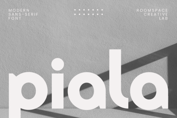
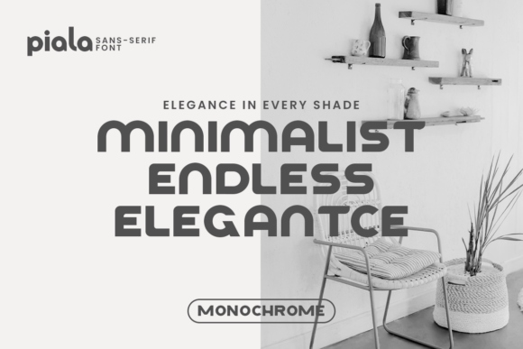
I believe Piala represents a unique take on the geometric sans serif font, where mathematical precision meets a friendly, approachable roundness. Its symmetrical shapes and smooth curves create a harmonious rhythm that feels incredibly fresh and contemporary. It lacks the harshness of traditional grotesques, offering instead a “monochrome” elegance that brings a sense of calm and professional balance to any layout.
This typeface is a top-tier choice for minimalist interior design branding, modern lifestyle blogs, and editorial headlines. The primary advantage is its perfect weight distribution, ensuring it stays readable and striking in high-visibility logos and digital interfaces. Whether I’m designing for a creative lab or a sleek home decor brand, Piala provides a sophisticated edge that feels both trendy and timeless.
7. Rincoln Font: Bold Geometry and Unshakeable Confidence
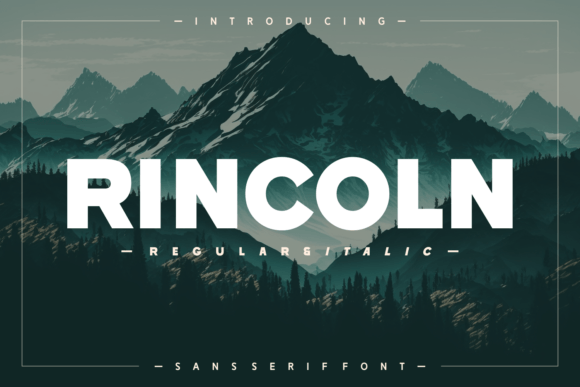
I consider Rincoln a true powerhouse among typography choices, especially when a project demands a geometric sans serif font that radiates strength. Its architecture is built on clean, straight lines and perfectly balanced shapes that deliver a sleek, ultra-modern vibe. I particularly appreciate the consistent stroke weight, which ensures every word remains crystal clear and impactful, whether it’s displayed on a massive billboard or a compact smartphone screen.
This typeface is a natural fit for bold branding, high-visibility advertising, and modern editorial layouts. The primary advantage of Rincoln is its distinctive character shapes that make a memorable statement without sacrificing professional readability. When I need to design striking logos or corporate identities that feel both stable and forward-thinking, this font provides the precise, heavy-duty aesthetic required to stand out.
8. Berlin: Achieving Maximum Impact with a Modern Geometric Sans
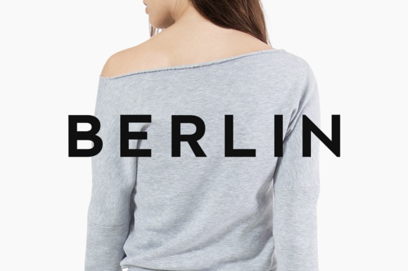
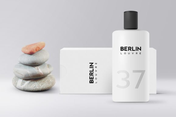
I appreciate how Berlin pushes minimalism to its absolute peak, drawing inspiration from classic geometric typefaces to create something entirely contemporary. It features four distinct weights that allow for precise control over visual hierarchy without cluttering the design. When I want a geometric sans serif font that feels both high-end and effortless, this is the one I lean on to provide that crisp, professional finish.
This typeface is a perfect match for fashion web stores, minimal portfolio websites, and high-impact headlines. I’ve found its true strength lies in headline creation; simply adding a bit of letter spacing results in an amazing, sophisticated look. Whether I’m working on digital branding or sleek editorial layouts, Berlin delivers a clean, polished aesthetic that ensures every message lands with maximum style.
9. Mango Dream: A Versatile Geometric Sans Serif Font with Global Appeal
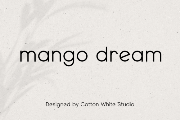
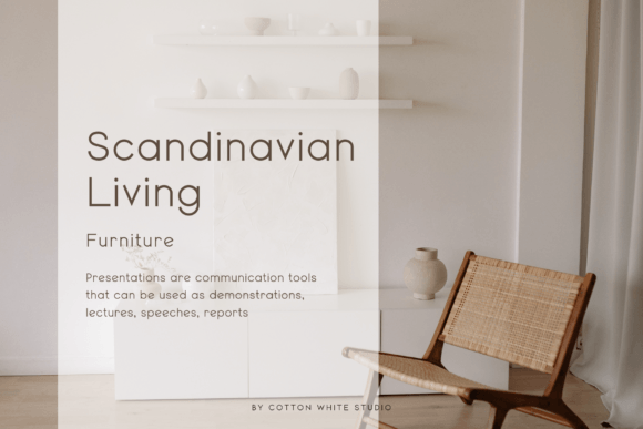
I believe Mango Dream perfectly captures the essence of modern, friendly design. This geometric sans serif font features a remarkably round and minimalistic shape that instantly softens the visual impact of any layout. I love how its clean, contemporary lines manage to feel professional without being overly rigid, making it a reliable choice for reaching a global audience through its built-in multilingual support.
This typeface is my top recommendation for scandinavian-inspired interior design, modern lifestyle branding, and polished digital presentations. The primary advantage is its exceptional balance; it functions beautifully as both a primary headline and subtle body text. Whether I’m building a minimalist website or a cohesive marketing campaign, Mango Dream provides that approachable, “human” touch that keeps designs feeling current and inviting.
10. Noar Font: The Definition of Architectural Clarity
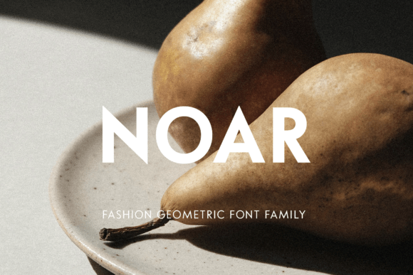
I find that Noar brings a rare level of structural integrity to the table, acting as a geometric sans serif font that prioritizes utility without losing its soul. It features five weights with matching italics, offering a minimalist aesthetic characterized by low visual contrast and moderately open apertures. The inclusion of stylistic alternates and an all-caps character set allows me to break away from standard layouts, giving every word a dynamic and authentic edge.
This typeface is my primary recommendation for impactful logos, high-end cosmetics packaging, and bold editorial headlines. The main advantage is its PUA-encoded nature, which provides effortless access to all glyphs for deep customization. Whether I am working on modern advertising banners or sophisticated book covers, Noar performs beautifully at large sizes, ensuring that branding remains sharp and legible in both digital and print environments.
11. Japandi: The Perfect Sans Serif Font for Minimalist Interior Design
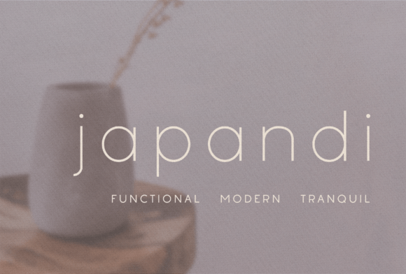
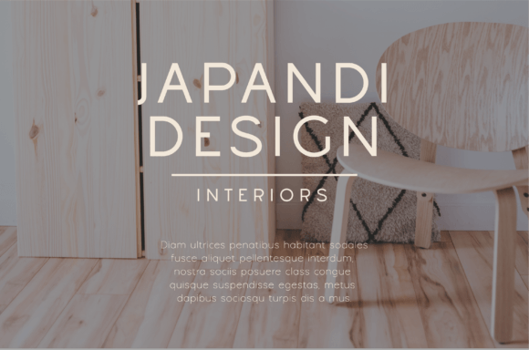
I’ve come to appreciate Japandi as a breath of fresh air for any minimalist layout. This geometric sans serif font features a lightweight, crisp design that perfectly mirrors the tranquility of its namesake aesthetic. Its thin, deliberate strokes provide a sense of open space and quiet sophistication, making it a natural choice for anyone looking to strip away the noise and let the message breathe.
This typeface is a top-tier selection for interior design branding, high-end invitations, and zen-focused social media content. The primary advantage is its ability to convey luxury through simplicity, ensuring a clean and polished look across all platforms. Whether I’m building a boutique website or a minimalist marketing campaign, Japandi delivers that calm, professional touch that feels both modern and timeless.
12. Morrow Font: The Contemporary Edge of Geometry
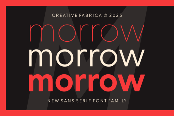
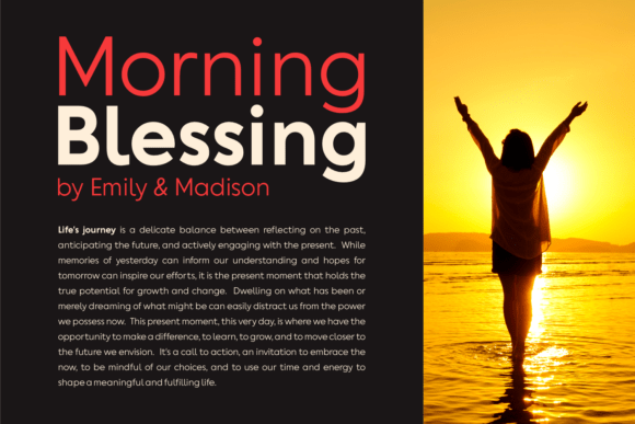
I look at Morrow and see a sophisticated geometric sans serif font family that strikes a beautiful balance between elegance and pure functionality. Inspired by the popular Gilroy, it offers six distinct styles that range from thin and refined to bold and impactful. I love how its clean, geometric structure feels instantly familiar yet modern, providing a reliable foundation for any designer who wants their work to look expensive and well-organized.
This typeface family is a natural fit for corporate branding, high-end web design, and sleek product packaging. The main advantage is its seamless adaptability; whether I’m working on bold advertising banners or minimal editorial layouts, Morrow remains crystal clear and professional. It’s a versatile powerhouse that ensures your typography communicates with both style and absolute authority.
13. Cloud: Airy Elegance and Geometric Precision
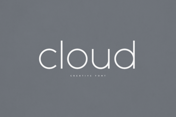
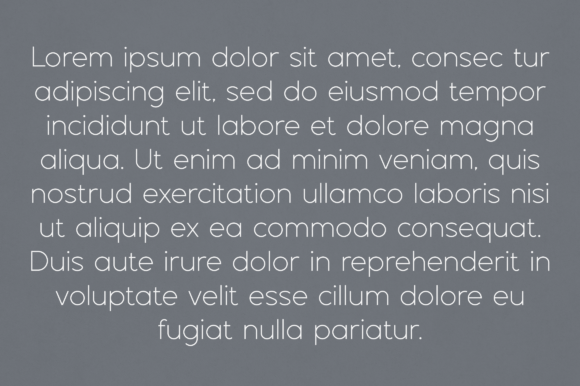
I think of Cloud as a breath of fresh air for any layout, offering an elegant take on the geometric sans serif font that feels both light and structurally sound. It possesses a unique ability to transform ordinary typography into something truly enchanting, whether it’s applied to a minimal logo or a lengthy block of text. Its versatility is its greatest strength, providing a sophisticated, airy feel that doesn’t sacrifice professional clarity.
This typeface is a perfect match for home-ware designs, high-end product packaging, and stylish magazine headers. The primary advantage is its seamless adaptability as a text overlay for background images, where its clean lines maintain high legibility. Whether I’m working on a branding project or a digital editorial, Cloud delivers a polished and unique aesthetic that elevates the entire visual narrative.
14. Tranquilo Font: A Thin and Modern Geometric Sans for Editorial Layouts
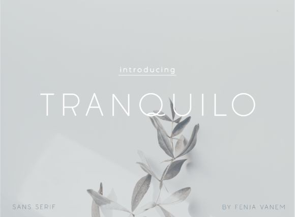
Slender lines and a whisper-thin weight make Tranquilo a standout choice when a project calls for a geometric sans serif font with an airy, elevated feel. I feel this typeface captures a rare sense of calm, stripping away any visual noise to focus on pure, minimalist form. It operates with a sleek precision that ensures every word feels deliberate and high-end, perfect for creators who value negative space as much as the text itself.
This delicate family is a natural fit for luxury branding, minimalist editorial design, and sophisticated digital advertising. The primary advantage is its ability to convey quiet elegance without being overbearing, making it ideal for wedding invitations or high-fashion lookbooks. Whether I am crafting a boutique logo or a clean website header, Tranquilo provides that sophisticated, modern touch that keeps a design feeling fresh and unhurried.
15. Mansfield: The Versatile Choice for Modern Typography
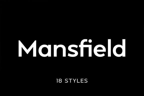
Clean lines and a sharp, neo-grotesque structure make Mansfield a standout geometric sans serif font in my current collection. I appreciate how it draws inspiration from icons like Futura, yet maintains a tall x-height that feels entirely ready for today’s high-resolution screens. With 18 styles to choose from, it offers a level of precision and professional polish that is hard to ignore when a layout needs to look both balanced and bold.
This comprehensive family excels in digital applications, high-end magazines, and commercial branding projects. The primary advantage of Mansfield is its sheer adaptability; it remains exceptionally legible whether used for striking posters or functional mobile UI. I rely on its minimal stroke contrast to deliver a sophisticated, contemporary edge that ensures corporate logos and website headers leave a memorable, professional impression.
16. Marshmallow: The Perfect Choice for Soft and Modern Branding
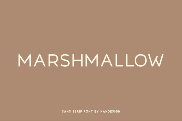
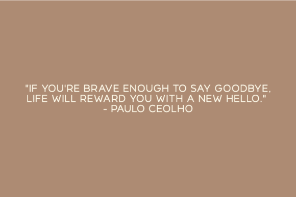
Plump, rounded forms and a playful spirit define Marshmallow, making it a unique standout as a geometric sans serif font. I love how its soft, approachable curves break away from the usual rigidity of geometric designs while maintaining a perfectly balanced structure. It brings an instant sense of warmth and friendliness to any canvas, ensuring that your typography feels modern yet incredibly inviting to the eye.
This charming typeface is my top pick for gorgeous invitations, stunning logos, and wedding stationery. The main advantage is its ability to make beautiful headings and display headers feel both professional and personal. I rely on its clean uppercase characters to add a polished, chic vibe to save the dates or creative branding projects where a touch of whimsy is needed to make a lasting impression.
17. Lemon Milk Pro FTR: Mastering Clean Typography
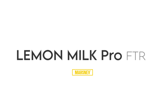
Bold geometric shapes and an unmistakable personality make Lemon Milk Pro FTR a must-have geometric sans serif font for any modern toolkit. I love how it balances its legendary sharp-edged heritage with a cleaner, more refined finish. It carries a certain cultural energy that feels both youthful and authoritative, ensuring that any text written in this typeface grabs attention instantly without trying too hard.
This striking family is a natural fit for bold headlines, modern branding, and impactful social media graphics. The primary advantage is its sheer presence, making it ideal for high-visibility posters and sleek logo designs. I often turn to this version when a project requires clean web headers that feel powerful and professional, providing that crisp, contemporary look that defines current design trends.
18. Givonic Font: Achieving Ultimate Clarity in Minimalist Design
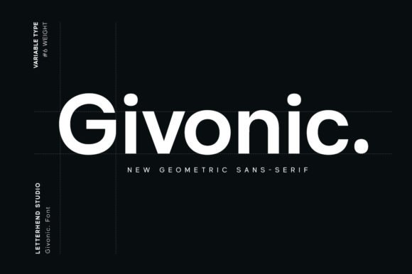
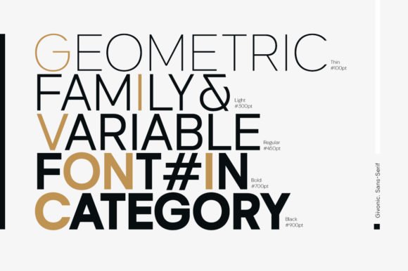
Sharp, mathematical lines and a whisper of modern elegance define Givonic, a geometric sans serif font that excels in stripped-back environments. I love how its balanced structure creates a sense of effortless order, ensuring that every character feels intentionally placed. It strips away unnecessary weight to focus on high legibility, providing a professional and neutral canvas that works beautifully for any project requiring a fresh, high-end look.
This versatile family is a perfect fit for minimalist web interfaces, modern logo designs, and sleek editorial layouts. The primary advantage is its neutral character, which makes it ideal for corporate branding and app development. I rely on its clean aesthetic to ensure digital presentations and print materials look polished, sophisticated, and remarkably easy to navigate without distracting the audience from the core message.
19. Masculine: Achieving an Authoritative Look in Your Next Project
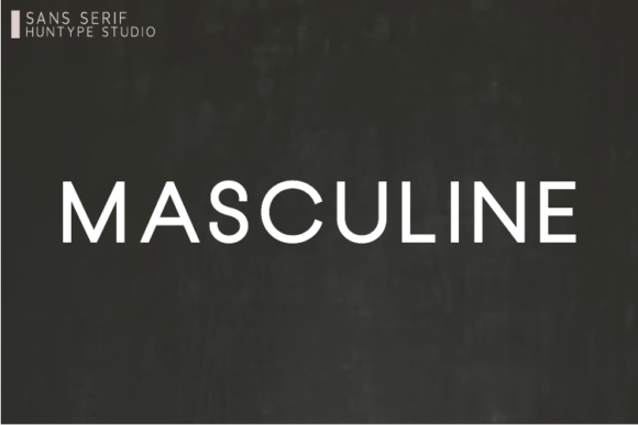
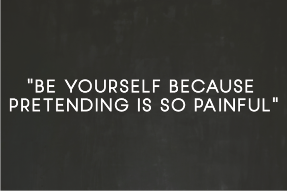
Sharp edges and all-caps letterforms make Masculine a powerhouse geometric sans serif font for any project requiring a strong, stable presence. I love how the smooth, clean lines interact with a subtle touch of contrast to create a rhythm that feels both architectural and modern. It possesses a certain weight that demands attention without overwhelming the rest of the layout, making every word feel like a definitive statement.
This commanding family is my top recommendation for luxury branding, web headings, and impactful logos. The primary advantage is its uncompromising clarity, which works exceptionally well for modern advertising and bold posters. I rely on this typeface to bring a sense of confidence to corporate identities or product packaging where a clean, professional, and authoritative aesthetic is necessary to stand out.
20. Minimalist Sans: The Secret to Understated and Chic Branding
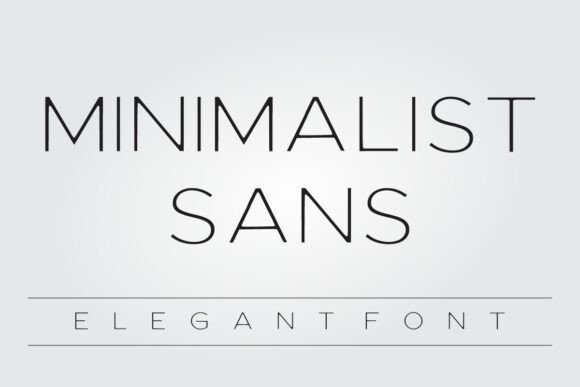
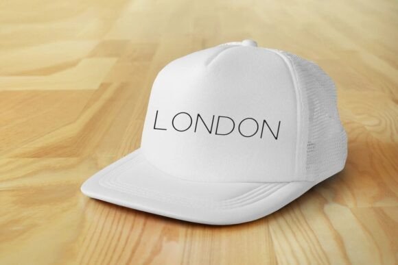
Slender lines and a relaxed, airy vibe make Minimalist Sans a refreshing addition to the world of the geometric sans serif font. I love how its informal style breaks away from the rigid corporate look, offering a soft and human touch that feels incredibly personal. It prioritizes a clean, simple silhouette that doesn’t scream for attention but instead invites the viewer into a calm and organized visual space.
This graceful typeface is an excellent fit for gorgeous invitations, meaningful quotes, and boutique product packaging. The primary advantage is its casual elegance, which works perfectly for t-shirt designs and minimalist labels. I rely on its thin strokes to add a sophisticated feel to creative posters and personal logos where a gentle, modern aesthetic is needed to convey a friendly yet professional message.
21. Handmade Wanderlust Duo Font: Bringing Playful Energy to Your Designs
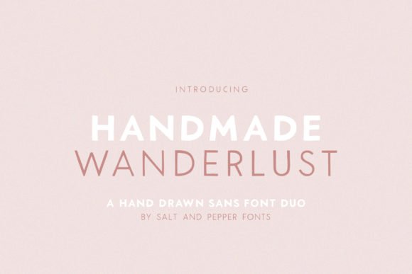
Soft, rounded geometry meets a charming hand-drawn feel in Handmade Wanderlust Duo, a versatile geometric sans serif font that brings instant personality to the screen. I love the balance between the thick and thin weights, which allows for a rhythmic, bouncy energy in every word. It moves away from cold digital perfection, offering a warm and humanistic vibe that feels incredibly approachable and fun for modern creators.
This delightful pair is a fantastic fit for cartoon related designs, children games, and playful branding. The primary advantage is its friendly silhouette, making it ideal for vibrant posters and social media graphics. I rely on this duo to add a lovely touch to creative merchandise and book covers where a sense of adventure and a lighthearted, professional look are needed to capture the audience’s imagination.
22. Square Space: Achieving an Innovative Edge in Modern Design
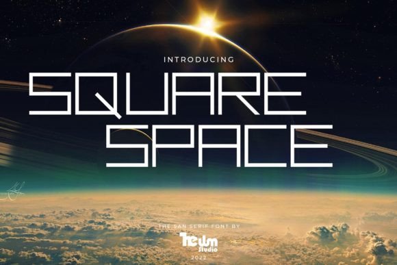
I appreciate how Square Space leans into a bold, futuristic aesthetic, functioning as a high-tech geometric sans serif font. Its structure feels heavily influenced by advanced machinery and digital precision, creating a sense of innovation that is hard to miss. I love the way the rigid, square-inspired forms provide a unique visual rhythm, making every word look like it belongs in a high-budget sci-fi production or a cutting-edge tech interface.
I recommend this typeface for sci-fi related designs, innovative branding, and tech startups. The primary advantage is its ability to instantly add a modern touch to high-tech posters and digital interfaces. I rely on its clean and robotic lines to craft striking logos and futuristic headlines that require a professional yet visionary look to stand out in the competitive world of digital design.
23. Brooklyn Font: The Secret to Sharp and Professional Typography
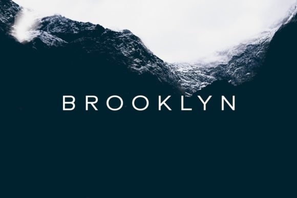
Clean, balanced proportions define Brooklyn, making it a remarkably versatile geometric sans serif font for any modern layout. I love how its neat, unassuming structure allows it to adapt to almost any aesthetic, providing a stable foundation that never feels dated. It offers a sense of architectural precision that helps a design feel grounded and professional, ensuring that your message remains the primary focus of the viewer.
This adaptable typeface is a perfect match for minimalist web designs, clean corporate branding, and urban-themed projects. The primary advantage is its neutral tone, which makes it ideal for modern advertising and sleek editorial layouts. I rely on its crisp lines to ensure digital presentations and sophisticated portfolios look sharp, providing a professional edge that helps creative ideas truly stand out.
Final Thoughts
Whether you need the boldness of a headline or the subtlety of body text, this collection has you covered. With these 23 tools in your kit, you’re ready to tackle any project with confidence. Keep experimenting with these geometric gems to ensure your work remains polished, modern, and professional.